Early personal computer keyboards featured a variety of function key symbols, but most were replaced with text labels as office users rejected confusing icons. Historically, the United States preferred text labels, while Europe favored icons; in multilingual Europe, a common visual language was highly useful for cross-border travel and product sales. In the evolution toward today’s personal computers and Windows keyboards, only four types of symbols became widely established: Shift, Enter, Tab, and Backspace. Among the symbols that have since faded into memory are Print Screen, which depicted the screen turning into paper, as well as key click sounds and Home. Some of these old key symbols remain in the Unicode standard, including continuous and discontinuous underline symbols. Hidden within the keyboards we press daily without a second thought lies a fascinating history of decades-long battles over character representation. In this first installment, we will closely examine the traces of various symbols that disappeared or were modified on traditional personal computer keyboards.
=
Key Symbols Lost to Time, Part 1: The Secrets of the PC Keyboards We Used
1. The Intense Historical Competition Between Text and Icons

The history of the split between text and icons in the early personal computer market is a fascinating aspect of keyboard evolution. Companies like Commodore, Atari, Amiga, and early Apple even placed their corporate logos directly on their keyboards. Past computer keyboards were filled with function keys that seem very unique and unfamiliar by today’s standards. Recently, Apple’s decision to increase the number of icons on US keyboards to make them closer to European versions provides a good opportunity to look back at the symbols that have disappeared from the Macs and PCs we use today. To understand this flow, the best shortcut is to first examine personal computer keyboards, whose history began even earlier. The competition between text and icons in the early 20th century likely appeared first on traffic signs rather than computers. The United States preferred the intuitive method of writing out words, while Europe used more icons that could be understood across borders. In Europe’s multilingual environment, a common visual language was needed so that people crossing borders could easily understand signs. In the home appliance and computer industries, using icons made it much easier to sell the same product across all of Europe without creating different product lines with different manual text. In the 1970s, IBM Selectric typewriters had separate US and European keyboards. “Express” acted as a very fast backspace, and “Index” moved the paper down; both are precursors to today’s arrow keys. The IBM 1130 machine in 1965 had a unique space symbol, and some experimental and scientific computers in the 1970s and 1980s used icons much more aggressively.
Early computer keyboards evolved differently by region, splitting into text-centric and icon-centric designs based on local culture.
2. Office Users’ Rejection and the Four Symbols That Survived
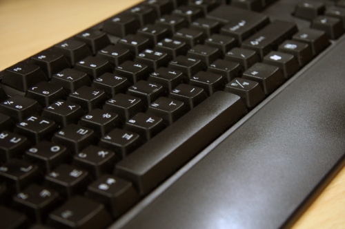
As computers spread from the exclusive domain of experts to general offices, the appearance of keyboards underwent significant changes. This was because office computer users actively rejected confusing symbols that were not intuitively understandable. Accommodating these user demands, most complex symbols were quickly replaced with easy-to-understand general text labels. In the process of evolving into today’s standard personal computer and Windows keyboards, only four types of symbols survived to the end and became widely established: Shift, Enter, Tab, and Backspace. These four core functions were absolutely necessary for operating a computer, so visual symbols and text labels reached a compromise over a long period. The four keys we press daily when working on documents are not just simple parts, but the result of feedback from countless users. In the past, many other symbols existed alongside these four, but most have disappeared with the passage of time. To reduce the confusion caused every time a user pressed a key, manufacturers gradually adopted standardized text labels. The US-style text-centric design played a major role in establishing this as a global standard during this process. However, traces of the past still remain subtly in the corners of keyboards or in special combination methods. For example, the reverse tab symbol located above the Tab key is a representative case showing how a legacy of the past has continued into the modern era. At the crossroads between features chosen by the public and symbols that were phased out, there was always a clear criterion: convenience.
Due to user rejection, most symbols disappeared, leaving only Shift, Enter, Tab, and Backspace.
3. The Original Functions of Disappeared Symbols and Their Remaining Traces

Past computer keyboards contained many symbols with unique meanings that are hard to understand by today’s standards. Notably, the Print Screen symbol visually represented the old CRT screen turning into paper. In that era, there was also a symbol indicating key click sounds, which made a noise every time a key was pressed. Key click indicators were very popular during the transition period when people moved from noisy typewriters to relatively quiet electronic keyboards. On the front of the now completely forgotten Reverse Tab key, the Home symbol was sometimes also engraved. Historically, the Home function meant returning the cursor to the top-left of the screen and sometimes even meant clearing the entire screen. The Insert symbol, which has largely disappeared from physical keyboards, and the still widely used Delete symbol were inspired by past publishing proofreading marks. At that time, there were endless attempts to express screen inversion, blinking, and underlining with original symbols. Unknown symbols, presumed to mean deleting an entire word, have also been discovered, though their exact usage is not certain. Traces of these old symbols still remain in Unicode, including continuous and discontinuous underline symbols. Although the exact historical background of this distinction has not yet been fully revealed, it gives us an idea of how meticulously past developers tried to construct keyboards. In a corner of the keyboard we press without a second thought, the intense interface concerns of our predecessors are preserved as they were.
Past symbols like Print Screen and Home originated from the technological environment and document proofreading methods of their time.
4. Reverse Tab and Hidden Functions That Still Exist

Delving deep into the history of keyboards reveals hidden functions and symbols that we use every day but know little about. For example, the Reverse Tab symbol still holds its place in a narrow space directly above the standard Tab symbol. The reason this symbol is placed on top is to intuitively inform users that it is a function requiring the Shift key to be pressed. However, many users mistakenly assume the two symbols are combined into a single Tab function symbol. The Unicode standard also contains a unique form with two arrows placed side by side, and many personal computer keyboards print the two arrows much closer together than standard Shift combination symbols. In contrast, Apple has traditionally printed only a single, clean Tab symbol, showing subtle differences between manufacturers. Some mistakenly believe that keys like Insert and Print Screen have completely disappeared, but in reality, they are still very much alive. Most standard desktop keyboards still proudly feature the Insert key, with it being omitted only on some laptop models. Print Screen is also firmly used as a representative shortcut function for taking screenshots in Windows and Linux environments. Reverse Tab is also actively used in web browsers and document programs by pressing Shift and Tab simultaneously or combining Control and Tab. When the author states that a symbol has disappeared, it means the visual symbol engraved on the physical button has been erased, not the button itself. Thus, while the shape of the keyboard has become simpler, the complex functions contained within have evolved into the form of shortcuts and still breathe under our fingers.
Although the graphical symbols on keyboards have disappeared, functions like Reverse Tab and Print Screen are still maintained in various ways.
5. The Modern Significance and Evaluation of Text and Icons

Looking back at the history of computer keyboards makes it clear how important intuitiveness and standardization were in the process of technology becoming popular. The flashy and original icons boasted by early laboratory and scientific computers failed to cross the wall of general offices and yielded their place to text. Complex symbols often became obstacles to popularization by increasing education costs and causing unnecessary confusion for users. On the other hand, labels clearly written in text, such as Shift and Enter, provided overwhelming clarity, even if they required overcoming a slight language barrier. The current refined keyboard layout was completed as a result of millions of office workers around the world hammering the keyboards thousands of times a day to verify quality. The characters in Unicode, a legacy of the past, still testify today to the traces of the visual language that developers of that era dreamed of. Unlike the past, the modern information technology environment has been completely reorganized around graphics in operating systems and program interfaces. However, the area of hardware keyboards stubbornly maintains the practical, text-centric tradition chosen by past office users. While the world on the screen is filled with flashy icons and graphic elements, the physical keyboard that our fingers touch is still filled with plain text. This contrast shows that the most important virtue a mechanical tool should have is not flashiness, but clarity that anyone can use without misunderstanding. The attitude of past computer users who rejected confusing symbols exactly matches the intuitiveness we look for when choosing digital devices today. Ultimately, the history of the keyboard was a continuous process of purification, stripping away excess so that more people could communicate easily and quickly.
The history of the keyboard is a record of popularization, choosing easy-to-understand text over complex symbols.
6. Future Outlook on Keyboard Changes and Our Attitude
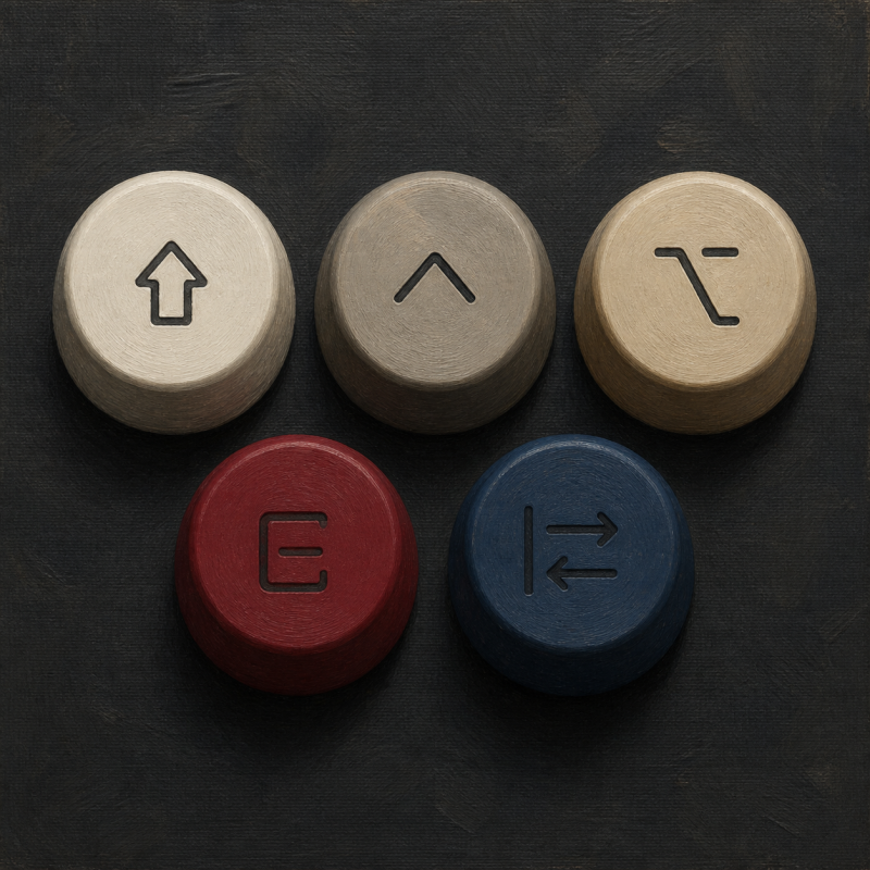
As time passes, the input devices we use are evolving beyond physical forms into virtual screens or AI-based interfaces. Knowing the meaning of the small symbols engraved on physical keyboards is a valuable experience that goes beyond mere intellectual amusement, helping us understand the footprints of tool evolution. Next-generation input devices are likely to introduce new forms of symbols or shortcuts to facilitate interaction with artificial intelligence. However, just as past office users rejected confusing symbols and chose text, complex visual elements lacking practicality will naturally be phased out. After reading this article, I encourage you to look down at the keyboard you use every day and recall the decades of history hidden within it. In the next installment, we will fully explore the world of another original keyboard design that unfolded in the Macintosh environment, so please look forward to it. The lesson left by a single small symbol that disappeared amidst technological advancement is ultimately that the master of the tool is always the person using it.
The future of keyboards will evolve based on practicality, and the next installment will continue with the original keyboard history of the Macintosh.
Frequently Asked Questions
=